The Return Stacking Visualizer
Overview
To further develop the intuition behind return stacking and capital efficiency, we have developed interactive tools that allow investment professionals to get their hands dirty with the concept of return stacking. In this post, we provide a detailed how-to guide on using the Return Stacking Visualizer tool.
Key Topics
Capital Efficiency, Education, Interactive Tools
Since the launch of Return Stacked® Portfolio Solutions, we have prepared a wide array of educational materials to provide a holistic curriculum for anyone interested in Return Stacking. To further develop the intuition of the concept, we have built numerous Excel-based interactive tools for investment professionals that make it easy to input custom portfolios, parameters, withdrawal assumptions.
In this post, we will explore the Return Stacking Visualizer, which allows the user to define a core portfolio, and review how stacking other investment assets and strategies would have impacted the portfolio’s performance using index data.
In all of the tools available, the first tab has detailed instructions on using the tool and the outputs.
The 'Portfolio Input' Tab
To begin, let’s first start by adding in a few base portfolios. The tool allows for up to 6 portfolio definitions at a time. To fully define these core portfolios, we will have to select the assets to be included and set the allocations to each asset in the portfolio. We additionally have the option to provide a custom name for each portfolio, set an advisory fee, and select the date we would like to start the analysis.
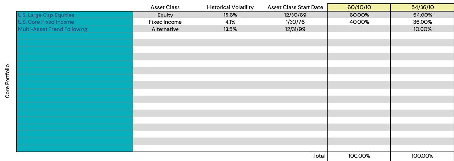
In the below figure, we can see that we have created a portfolio named “60/40/10”, and a portfolio named “54/36/10”. The 60/40 portfolio has a 60% allocation to U.S. Large Cap Equities and a 40% allocation to U.S. Core Fixed Income. The 54/36/10 portfolio holds a 54% allocation to U.S. Large Cap Equities, a 36% allocation to U.S. Core Fixed Income, and a 10% allocation to Multi-Asset Trend Following. Note that the “Core Portfolio” section requires that the weights sum up to 100%.
Figure 1 also shows that, upon selecting an asset from the drop down, that asset’s Asset Class, Historical Volatility, and Asset Class Start Date are populated.
Figure 1: Defining the Core Portfolio
Source: Newfound Research. For illustrative purposes only. Results are not intended to be investment advice.
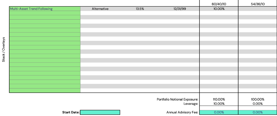
To add a stack or an overlay onto a portfolio, we will move to the lower section of the portfolio input tab and stack an additional 10% allocation of Multi-Asset Trend Following to the “60/40/10” portfolio. We will leave the “54/36/10” portfolio unstacked.
In Figure 2, we can see the sections to adjust the “Start Date” and set an Annual Advisory Fee. We will leave those unchanged for this post but note that they are available as parameters. If no ‘start date’ is selected, the tool will default to common inception of the indices shown on the sheet (including those where no allocation is made).
Figure 2: Stacking Returns onto a Core Portfolio
Source: Newfound Research. For illustrative purposes only. Results are not intended to be investment advice.
Now that we have added a stack on to the “60/40/10” portfolio, we see that the Portfolio Notional Exposure is 110% with 10% leverage, while the “54/36/10” remains at 100% Portfolio Notional Exposure and holds 0% leverage.
Register for our Advisor Center
Tools Center:
Easily backtest & explore different return stacking concepts
Model Portfolios:
Return stacked allocations, commentary and guidance designed
for a range of client risk profiles and goals
Future Thinking:
Receive up-to-date insights into the world of return stacking theory and practice
Analyzing a Portfolio in Isolation
Now that we have set the portfolios that we would like to analyze, we can move on to the tab that encompasses that portfolio. Though, we have renamed the portfolios, the “60/40/10” portfolio is the first portfolio, so to review the results, we will review the “Portfolio 1” tab.
In the “Portfolio 1” tab, we can now see seven distinct sections of performance statistics and figures showing the performance of both the core portfolio, as well as the stacked portfolio (the core portfolio, plus whatever was ‘stacked’ on top). To review these, we will start from the top and go row-by-row.
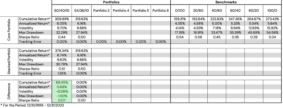
Figure 3: Return Statistics, Return-to-Risk, and Return-to-Max Drawdown
Source: Bloomberg, Newfound Research. For illustrative purposes only. Results are not intended to be investment advice. Returns assume the reinvestment of all distributions. Returns are gross of all fees, transaction costs, and management fees, unless otherwise specifies. Performance is backtested and hypothetical. You cannot invest directly in an index.
In the left of Figure 3, we can see the performance statistics of the core portfolio, the stacked portfolio, and the difference (green indicating an improvement, e.g. higher return, lower volatility, lower max drawdown, and higher Sharpe ratio. Red would indicate a deterioration in the metrics).
In the middle of Figure 3, we show the Return-to-Risk graphic of both the core portfolio, the stacked portfolio, as well as the results for a 0/100, 20/80, 40/60, 60/40, 80/20, and 100/0 Global Equities / U.S. Core Fixed Income portfolio (shown in grey).
Finally, on the right side of Figure 3, we show the Return-to-Max Drawdown graphic, again for both the core and stacked portfolio, as well as the 0/100 – 100/0 Global Equities / U.S. Core Fixed Income portfolios (again, depicted in grey).
Figure 4: Equity Curve and Drawdown Curve
Source: Bloomberg, Newfound Research. For illustrative purposes only. Results are not intended to be investment advice. Returns assume the reinvestment of all distributions. Returns are gross of all fees, transaction costs, and management fees, unless otherwise specifies. Performance is backtested and hypothetical. You cannot invest directly in an index.
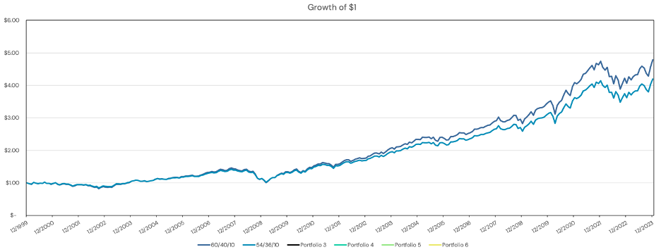
Figure 4 shows the second row of the figures in the “Portfolio 1” tab. On the left side we can see the classis “Growth of $1” graphic for both the core portfolio and the stacked portfolio. The right side shows the Drawdown Curve for both.
Figure 5: Relative Returns and Asset Allocation
Source: Bloomberg, Newfound Research. For illustrative purposes only. Results are not intended to be investment advice. Returns assume the reinvestment of all distributions. Returns are gross of all fees, transaction costs, and management fees, unless otherwise specifies. Performance is backtested and hypothetical. You cannot invest directly in an index.
In the final row of the “Portfolio 1” tab, we can see two additional figures.
On the left side, we see a “Relative Returns” graph which shows the relative outperformance of the stacked portfolio relative to the core portfolio, in this case, a 60/40/10 portfolio versus a 60/40 portfolio. This graph can be interpreted fairly easily:
- When the line is going up, the stacked portfolio is outperforming the core portfolio.
- When the line is flat, the stacked portfolio is performing in line with the core portfolio.
- When the line is going down, the stacked portfolio is underperforming the core portfolio.
The Asset Allocation graph is fairly self-explanatory, but one point that we would like to emphasize is that if a portfolio holds any stacking, there is an embedded “financing” allocation, which applies to any leverage embedded in the portfolio. In Figure 5, we see that since the “60/40/10” portfolio holds 10% leverage, the financing allocation amounts to -10%, which effectively means we are borrowing 10% to purchase the additional 10% notional exposure.
Although we have defined the second “54/36/10” portfolio, we will not review the outputs in the “Portfolio 2” tab as they will largely be the same. The exception, of course, being that there will be no “Stacked Portfolio”, as we did not stack any exposures in that portfolio.
The Summary Tab
The Summary tab is a concise way of comparing across all of our defined portfolios, as well as the 0/100 – 100/0 Global Equities / U.S. Core Fixed Income benchmarks. This tab shows many of the same figures as we described above, with all the total portfolios shown in one graph.
As in the individual portfolio tabs, we show performance statistics, Return-to-Risk, Return-to-Max Drawdown, the equity curves, and the relative returns of the stacked portfolio to the core portfolio.
Figure 6: Summary Portfolio Statistics
Source: Bloomberg, Newfound Research. For illustrative purposes only. Results are not intended to be investment advice. Returns assume the reinvestment of all distributions. Returns are gross of all fees, transaction costs, and management fees, unless otherwise specifies. Performance is backtested and hypothetical. You cannot invest directly in an index.
Figure 7: Summary Risk-To-Return and Drawdown Figures
Source: Bloomberg, Newfound Research. For illustrative purposes only. Results are not intended to be investment advice. Returns assume the reinvestment of all distributions. Returns are gross of all fees, transaction costs, and management fees, unless otherwise specifies. Performance is backtested and hypothetical. You cannot invest directly in an index.
Figure 8: Summary Growth of $1
Source: Bloomberg, Newfound Research. For illustrative purposes only. Results are not intended to be investment advice. Returns assume the reinvestment of all distributions. Returns are gross of all fees, transaction costs, and management fees, unless otherwise specifies. Performance is backtested and hypothetical. You cannot invest directly in an index.
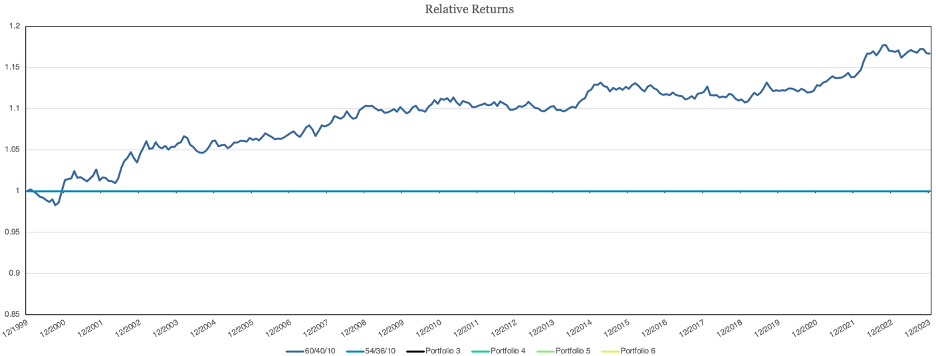
Figure 9: Summary Relative Returns
Source: Bloomberg, Newfound Research. For illustrative purposes only. Results are not intended to be investment advice. Returns assume the reinvestment of all distributions. Returns are gross of all fees, transaction costs, and management fees, unless otherwise specifies. Performance is backtested and hypothetical. You cannot invest directly in an index.
In Figure 9, we will note that the “54/36/10” portfolio has a relative return line, though, since there was no stack added to the portfolio, that line is exactly zero.
Additional Tabs and Functionality
One final output tab, that we feel does not need to be explained in-depth, is the “Calendar Year Returns” tab towards the end of the workbook. This tab shows the calendar year returns of both the core portfolios and the stacked portfolios, as well as a bar graph at the bottom showing the total portfolios by year.
Finally, a recent addition to the tool is the ability to add your own custom assets to the tool, whether that is an additional asset, strategy, or portfolio. To access this functionality, go to the “Custom Asset Returns” tab and input the monthly returns of whichever custom asset you’d like into the spreadsheet. In Row A of the tab, you can select the asset class you’d like to categorize that asset as, and in Row B, you can change the name of the asset from “Custom Asset #X” to a name of your choosing. After inputting the returns, and changing the name and asset class (if desired), this asset will be available from the dropdown in the “Portfolio Input” tab.
Conclusion
In our effort to simplify the intuition behind return stacking, we have built numerous Excel-based tools to allow for those interested to learn how stacking can impact a portfolio in an interactive way.
The Return Stacking Visualizer tool allows the user to define custom assets, asset allocations, and stacks to easily assess the impact that return stacking may have on a core portfolio.
If you have are an investment professional and would like to get access to the tool, please go to https://www.returnstacked.com to request access to the tool, or get in touch with us.
